Court-Records: An Ace Attorney Fansite

Important information about this in-development beta

Feature and styling suggestions

I love the design direction and style that you're going with so far but I feel like the main page is too busy right now. Maybe add more breathing room? I have some suggestions but I'm still a student so take it with a grain of salt:

- I prefer the links to be in a header (Just like the current CR site) than in a sidebar, it's distracting and taking up too much attention. Maybe make it take up less space on the screen or reduce the number of links.
- Make the header more prominent because right now it's a bit lost among the content but I think it's just because it's still in beta and the header will be replaced later.
- The background is also too strong so maybe make it more subtle. Again, like the current CR site.

Looking forward to the site updates though, it looks neat and I'm scrolling through the new content at the moment.

I'm also going to complain about Arial, but just in the nav bar. I don't really have a problem with it as the post body font (honestly I'm just glad it's not serif), but there's something very "My first website" about using large Arial font in the sidebar.

Other general design things:

  • On the topic of "My first website", the scrollbar for the navigation harks back to the Angelfire days of frame-based web design. But since Firefox AFAIK doesn't support a more discreet custom scrollbar, the only way to avoid my painful '90s flashbacks is to make the nav bar less tall (smaller font or collapsible categories, maybe?)
  • The extra titles at the top and the report/edit buttons at the bottom of forum posts take up a lot of unnecessary vertical space. Floating the buttons in the post area (as opposed to beneath the signature) and moving the post title in next to the timestamp would make things a little sleeker.
  • Post previews need a solid-colour background at the very least to make them readable, but it'd be cool if they showed up in something that actually looks like the post box.
  • The poster box on the left eats into bulletted lists that wrap around it. Not a huge issue, could be fixed just by bumping those elements a couple pixels to the right.

My only gripe otherwise is forum navigation. The sidebar takes care of navigating the main site pretty well, but trying to navigate the forum past the index page is terribly disorienting. There's currently no way to navigate back to or even identify the subforum you're in when reading a topic. Same goes for the post editing page; there needs to be a 'Cancel' or 'Back' button to take you back to the topic/subforum you were in without saving, and somewhere actually labelling what topic/subforum you're posting in.

@adha.aiman I'm curious if you have any specific examples of parts of the site that seem informal/old. The site's design is a mix of all the games up till AA5, remember that the redesign was first conceptualised before Dai Gyakuten was even announced.

@The Blue Avenger Good idea for the sprites. I haven't got around to styling the sprites/animations/books yet, but I can see a solid background working well; perhaps a dark box like the one that is used with fanart would work. I know at one point the avatars didn't resize, I will look into it and see if there was a technical reason they are scaled or if I can let them be their original size. I understand wanting to have the posts closer together but it is hard to find vertical space to be removed, I will think on it. (and suggestions are always welcome) Personally I don't find it odd to have the first line wrap at the date, but that is just me. And finally, don't worry about being picky. The more feedback the better!

@Cyanoïde There is still a lot of content that needs to be added to the site. What menu font are you thinking of?


So apparently I missed the second page of comments...

@TheGreatSnarkoo Truth be told I haven't given a lot of thought to the body font yet. But Arial is very similar to the font used in the AA games, and I would prefer not to use a custom body font so people wouldn't have to download normal, bold, and italic versions of the same font.

@kidzuki There is a lot of links on the new site so it seemed to make sense to put them in a scrollable sidebar. But I see what you mean about it being a bit distracting, perhaps a darker background would make it standout less? If you mean make the header at the top of every page more prominent, then yes we have a couple ideas in the works to make it more interesting. The background had always been a bit of a challenge to get right, but I tried to keep most of the important text inside darker boxes so text is easy to read.

@Marshmello's second post: I could see how reducing the size of the sidebar would be nice, but I don't think it is going away any time soon, sorry. Good ideas about recuping vertical space. Previews, as I'm sure you noticed, haven't been styled at all yet. I have been thinking that a breadcrumb trail in the navbar would be useful, I think that would greatly help navigation.


@Cyreb
No, no. The site just feels like an old website I used to visit :P Formal and informal is just a matter of speech XD
*ehem*
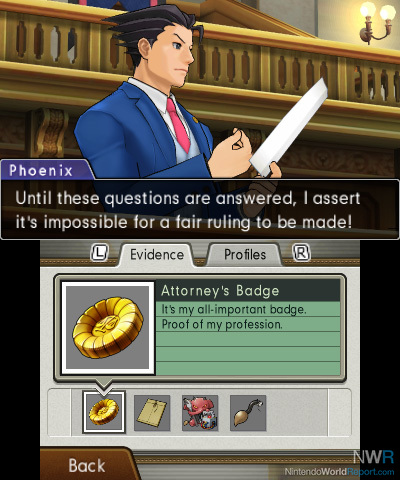
Why not make forum posts similar to the text box from Dual Destinies? Where the poster name is in the blue tab, picture to the left. Or take inspiration from the profile tab? Taking @kidzuki's opinion into account, why not make section navigation like the evidence, profile tab?

Also, maybe it's because the lack of color gradient, for now, like this:

Of course these are just suggestions :D